General Motors: Redesigning the Workload Management Dashboard

Internship | Project duration: 6 months | Nov 2021 - Apr 2022
Live April 2022
End-to-end design
Full-stack development
Interaction design
During my internship at General Motors, I led the design and development of the workload management platform to create a centralized platform for managers to monitor the team’s workload, make informed decisions on effective resource allocation, and increasing visibility across different teams.
Project Overview

However, the current database is inefficient and lack accuracy, many managers stopped using the database and created their own siloed version.

Wearing both the developer and designer hat.
Redesigning and coding the database from scratch was a major roadblock as the original code base was unsalvageable and undocumented. I will be learning Excel VBA with no prior coding experience.
Challenge
Improved user adoption by 3.5x, increased database refresh speed by 80%, gathered 40+ high-impact improvements from 5 in-depth UX testing.
Outcome
User research
UI & Interaction design
Full-stack development
User testing
Contribution
Me — UX designer & developer
Sissi Ke — UX mentor
Mark Campbell — manager
Team
01
Diving right in
Auditing the platform
I interviewed Mark Campbell, my manager who will be one of the main users, to understand his current pain points. I discovered that not only did the database have a slow response time, the navigation was confusing and prevented many managers from using the database efficiently.
What are the business needs?
The managers wanted to completely replace the existing database in Access with another software that can process data in large volumes, and have an intuitive user interface to interact with the backend. Since most managers are experts in Excel, we decided to rebuild the database from scratch using Userform and Excel VBA.
02
Identifying gaps
Throughout the process, managers stopped using the current database because it was “cumbersome and time-consuming to work with”, many created their own version on the side. To start, I interviewed Mark to understand the purpose of the database and his pain points better.
How might we...
help managers assign projects to their team quickly, and make more informed decisions about resource allocation?
03
Co-creating an ideal flow
To ensure the database is intuitive, I co-created an ideal user flow with 3 managers across the General Motors in Oshawa. Our goals was to simplify task assignment process and reduce input time.
From here, we will tackle each pain point.
04.01
Confusion with buttons
“I don’t need these buttons... all I need is to manage my projects, add a new project, add new team members and edit their information.” - Mark
Original design
Exploration #1
Recategorizing functionality into two flows: manage projects and manage teams. The wireframe below shows the steps to manage a project or team, and only exposing functionality when needed.
Feedback: Managers needed data visualization to understand how effective their resource allocation was. The feedback was echoed by managers across other teams.
Exploration #2: adding dynamic data visualization
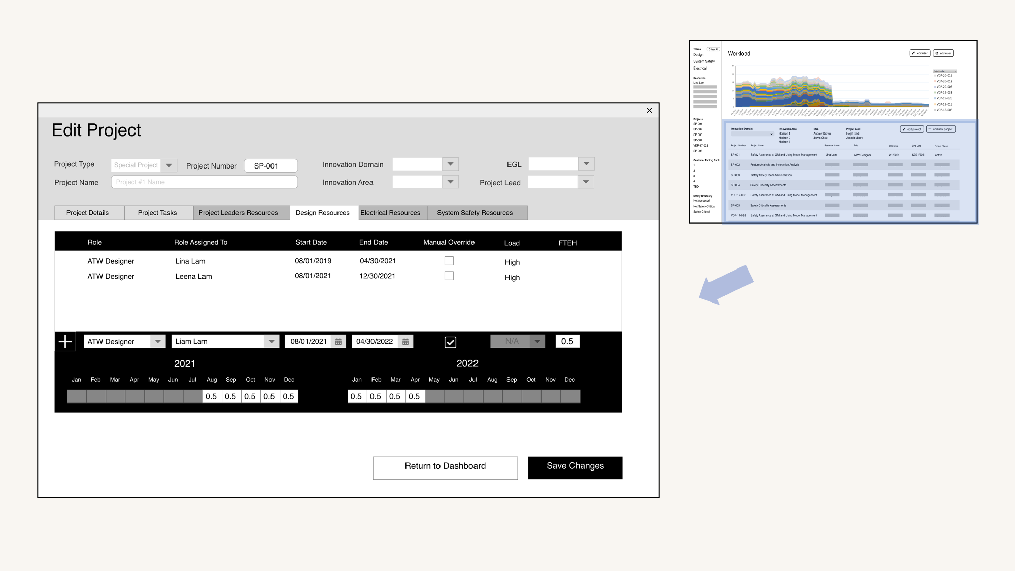
Changing the workload allocation in a project will update the workload distribution chart in real-time.
Feedback: Managers want to see workload distribution on a two-year basis, as members are often assigned to long-term projects.
Exploration #3: efficient placement of the visualization
V3: The horizontal chart shows workload breakdowns on a monthly and weekly basis, and is favoured by the majority. The horizontal use of space shows the workload breakdown in details.
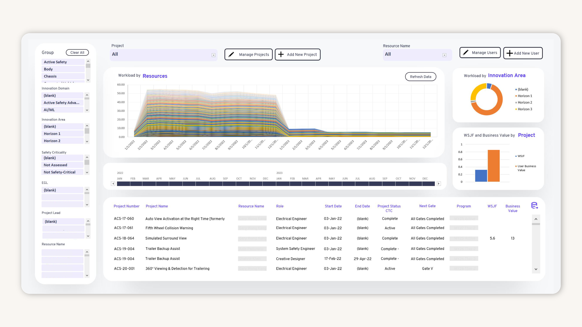
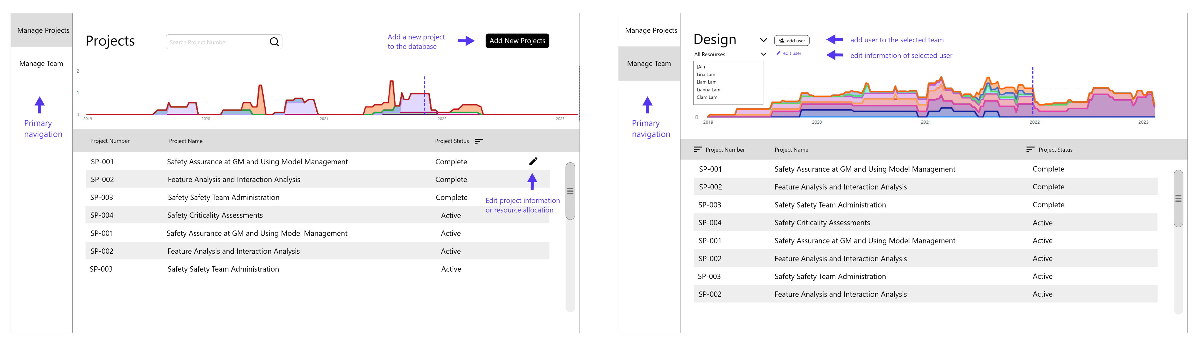
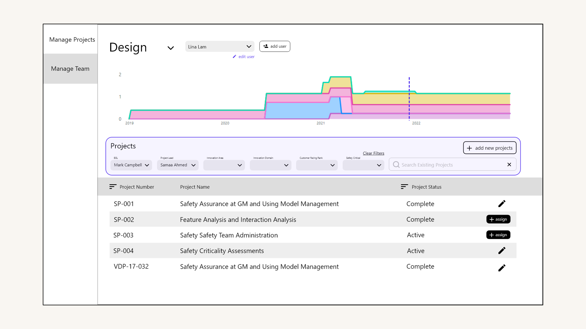
Final design
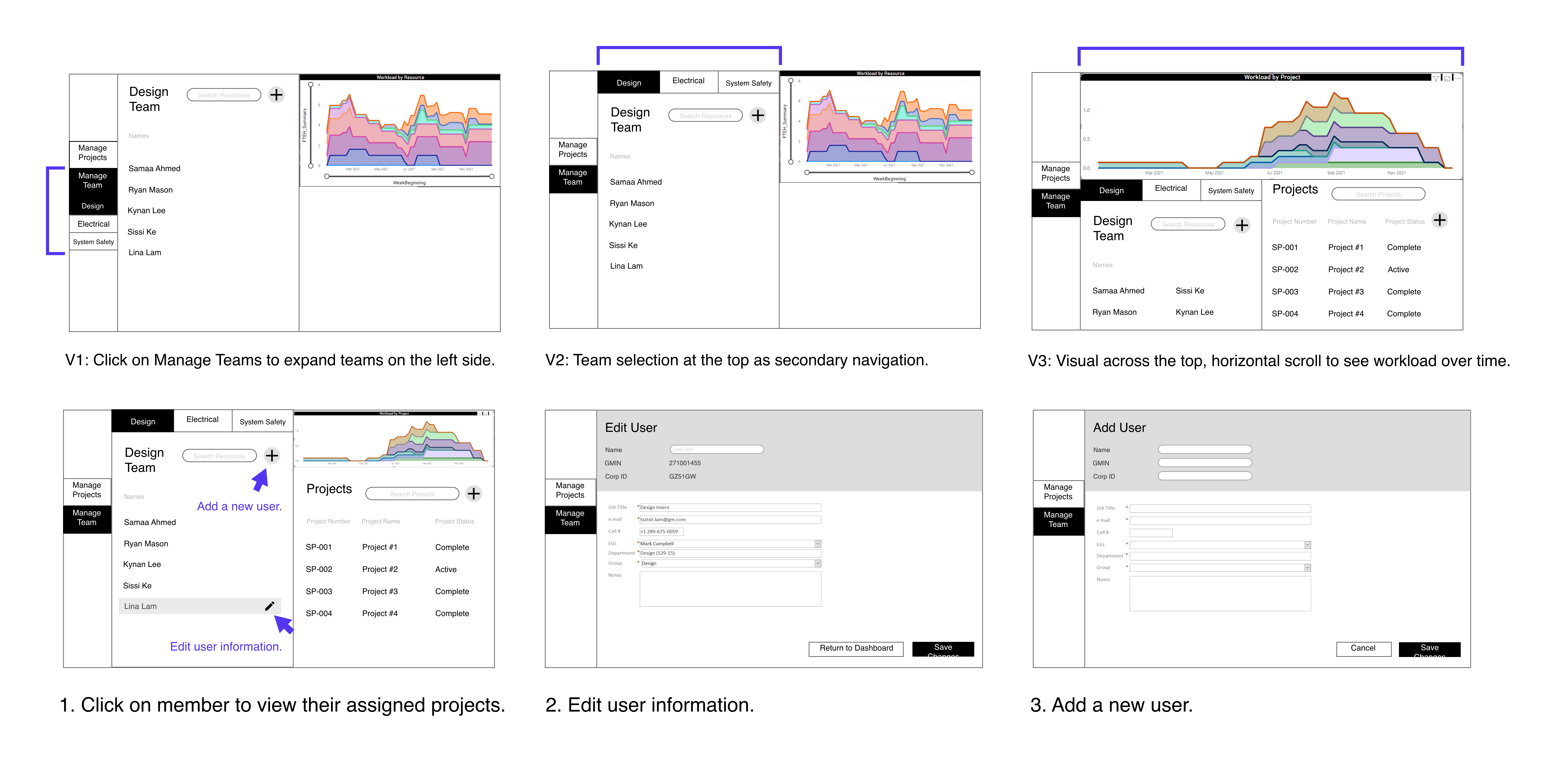
The main dashboard uses primary + secondary navigation buttons to progressively reveal options. The database now has 4 main buttons: edit / add users, edit / assign projects, which effectively reduces learning curve for new managers joining GM.
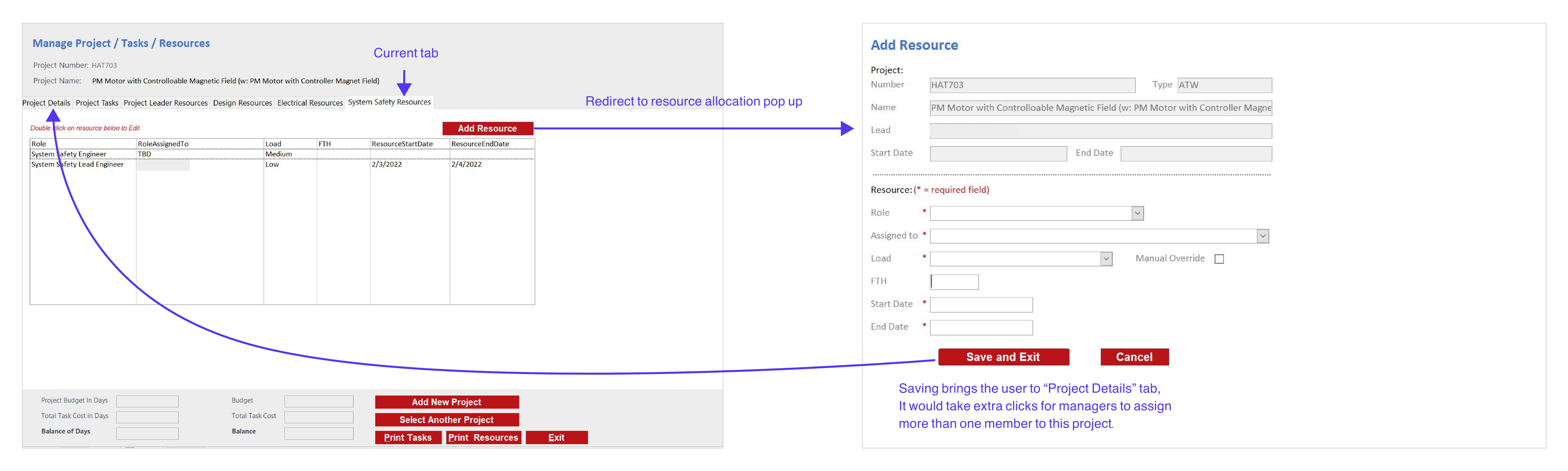
04.02
Finding project is time-consuming
“There are about 5000 projects in the database, and I don’t always remember the project number. Every year there are more to be added.” - Mark
Original design
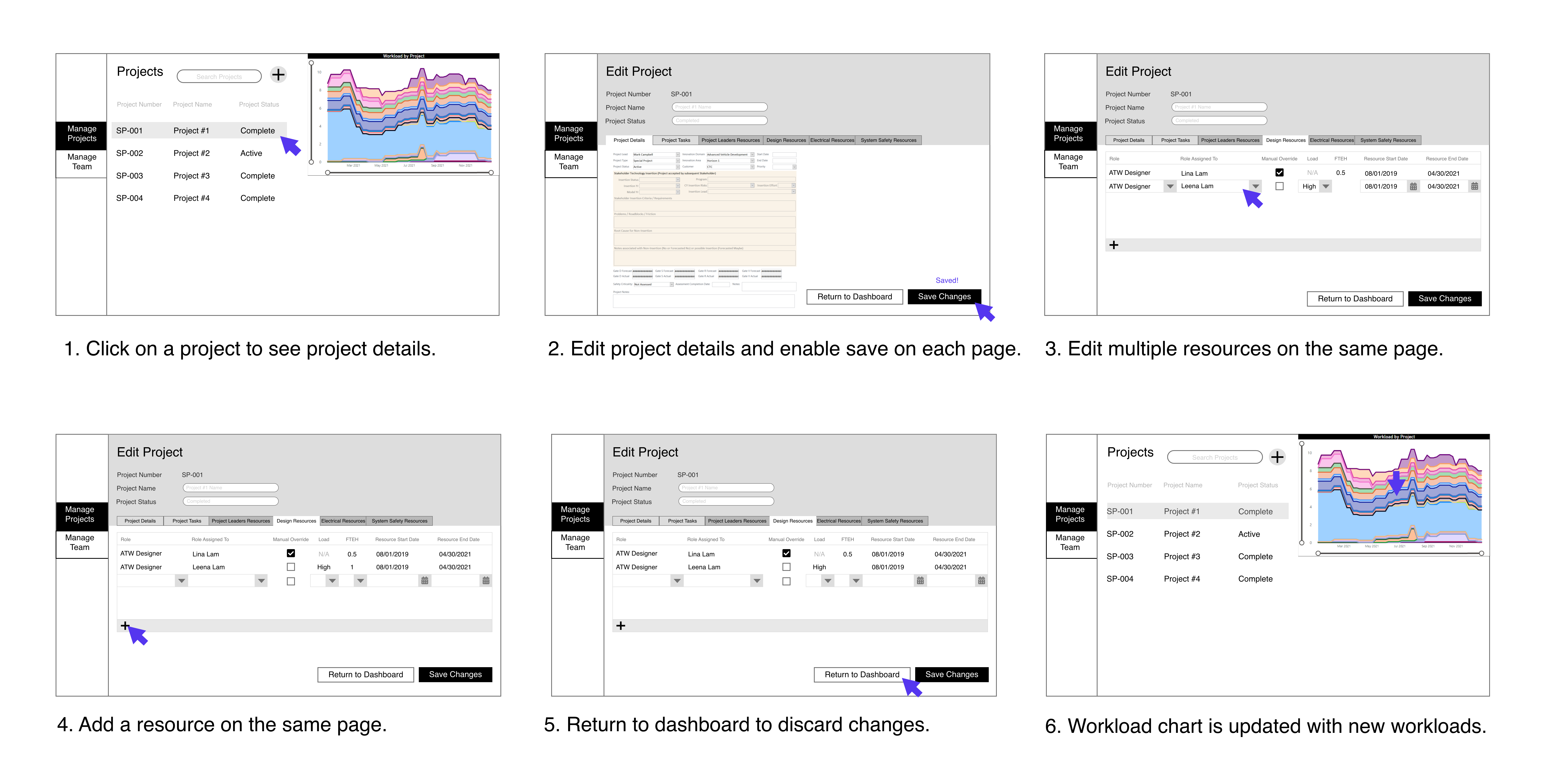
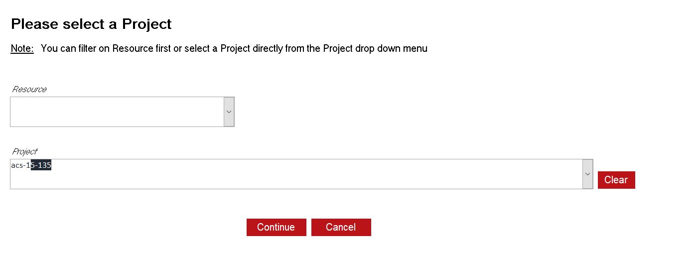
Previously, managers have to know the project number in order to find the right project in this database, but they don't always remember them - causing friction in the experience.
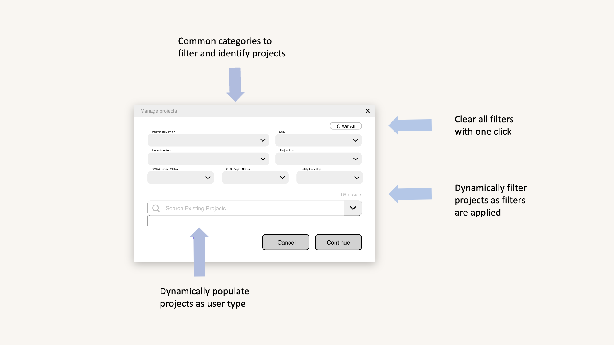
Exploration #4: Dashboard filter designs
To narrow down search results, I created a few filter designs with criteria that were familiar to users.
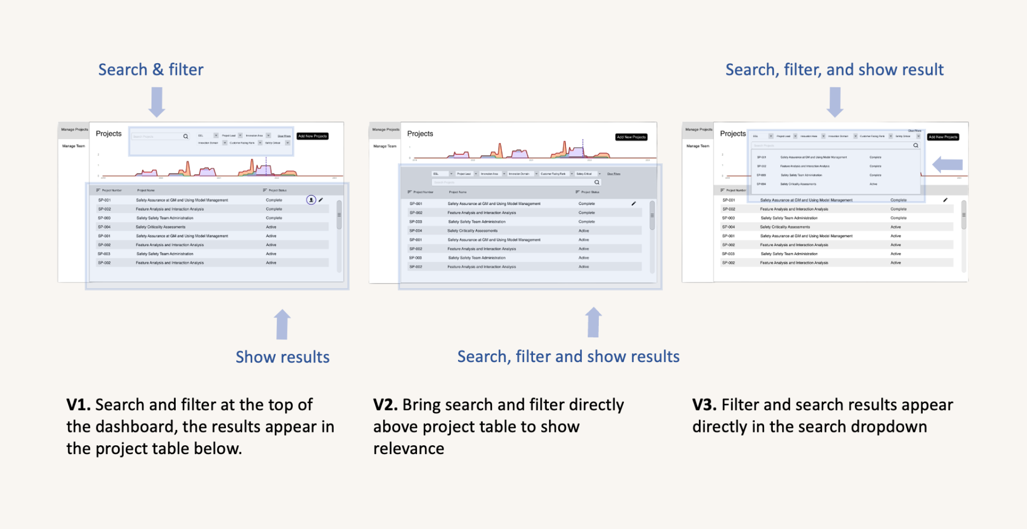
Feedback: Users preferred V2 and V3. However V2 - using the project table for both display and search - was difficult to implement within the given timeframe. I moved forward with a combination of V2 and V3 option upon my manager’s recommendations.
Redesign
Decision: Using the filters, managers only need ONE criteria to find the project, reducing cognitive load and help with recall.
04.03
Too many clicks to assign members
“It’s extremely frustrating when you get redirected every time you assign someone, it’s just really inefficient. ” - Mark
Original design
Previously, when managers want to add multiple members to one project, they have to add one at a time before being redirected to a new screen.
Redesign
Now, managers can add multiple members at the same time without leaving the screen.  
04.04
What about the other users?
At this point, some Senior Engineer Leads found the database to be useful for managing teams. However, their goal is to see a workload overview rather than assigning projects. They worry about accidentally modifying the database.
Revised dashboard design
To protect core data and prevent accidental modification, I unified all button designs, allowing leads to see the statistic at a glance. Managers now must click on “Edit Project” button to make changes instead of directly on the dashboard. A new filter pop-up is designed to search for projects.
Dashboard in Excel, no code yet
This is a fully interactive dashboard created in Excel. Some data has been grayed out due to confidentiality.
04.05
Too long to save
“I exited the database because it took too long to save.” - Mark
I followed online tutorials to understand how Excel interacts with VBA, then I created a centralized source with consolidated backend data to read and write from. After some trial and error, I was able to improve the speed of searching for a project by 11x, from 39 seconds to 3.5 seconds!
05
Metrics
The following business, technical and design metrics were measured:
User adoption
User adoption
Occupied space
Runtime
User satisfaction
Original
11%
46 MB
45 seconds
unmeasured
Redesign
77%
3 MB
16 seconds
To be updated upon user testing in February 2022
06
Challenges + Next steps
  1. Not everything went as planned. The design underwent multiple iterations to accommodate for technical limitations. However new changes always reflect the ideal user flow to keep in mind user objectives.
  2. Being both the developer and designer was a challenge. If I had more time, I would turn designs into components to have a more cohesive interface.
  3. In late February, I will conduct user testing with each user groups by asking them to perform the four tasks, and measure task-level user satisfaction.
07
Learnings
Huge thank you to the Studio North team for the challenging 8-month internship. Working as a design intern in the automotive innovation space showed me the importance of crafting unbiased questions, following the strategic foresight framework to anticipate trends, and iteratively refining the designs, allowing me to discover blindspots and areas for improvement as a junior designer.